
Otus is a healthcare technology company that specializes in technological solutions and follow up care for personal wellness. A seamless connection between the patient, healthtech wearables and follow up in-person care or remote clinical care is the foundation of this revolutionary company.
Moment was asked to name the company and create a visual brand identity system. The result is a future forward visual brand identity system that will help them gain the trust they need as experts in this cutting edge new market.

The brand’s visual identity symbolizes the seamless connection between patients, health technology, and personalized care. Two forms converge into one, representing unity, trust, and the brand’s commitment to patient-first healthcare—where human connection remains at the heart of innovation.


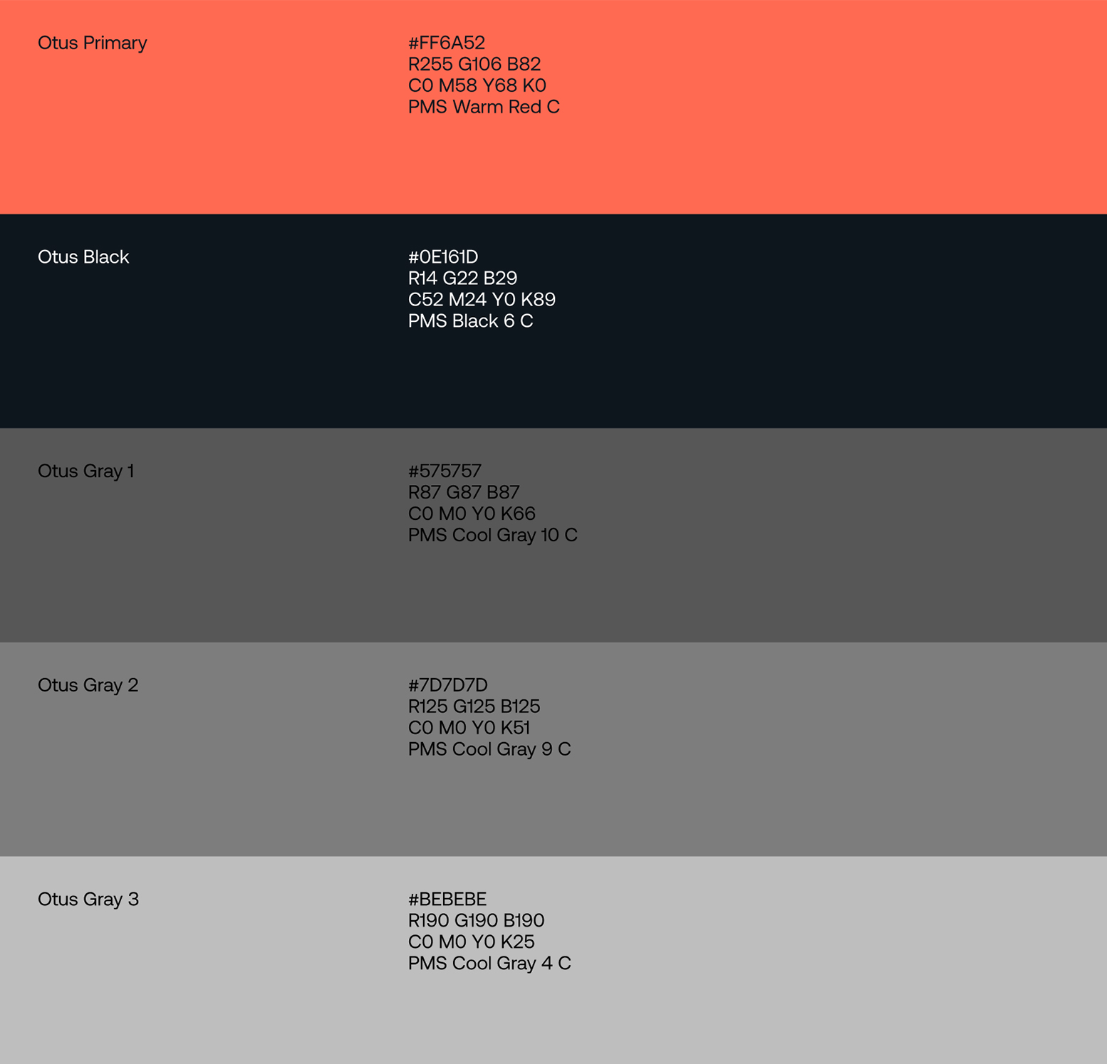
Selecting the right typeface was critical in communicating Otus’ future-forward vision and deep technological expertise. For the brand system, we required a typeface that was both timeless and highly functional across print and digital applications. Aeonik proved to be the ideal choice, balancing simplicity with precise mechanical details.
Paired with a restrained, modern color palette, the full type family was integrated into a structured system, with comprehensive guidelines ensuring consistency across the Otus brand architecture."

To ensure consistency and cohesion across all brand touchpoints, we developed a unified grid system that serves as the structural foundation for Otus’ design language. This system creates a seamless visual rhythm, optimizing alignment, spacing, and hierarchy across digital and print applications.
In parallel, we established comprehensive photography guidelines to reinforce the brand’s identity—defining composition, lighting, and subject matter to maintain a balance between human-centric storytelling and technological precision. Together, these elements create a clear, adaptable framework that strengthens the Otus brand experience.


The brand’s visual identity symbolizes the seamless connection between patients, health technology, and personalized care. Two forms converge into one, representing unity, trust, and the brand’s commitment to patient-first healthcare—where human connection remains at the heart of innovation.
Selecting the right typeface was critical in communicating Otus’ future-forward vision and deep technological expertise. For the brand system, we required a typeface that was both timeless and highly functional across print and digital applications. Aeonik proved to be the ideal choice, balancing simplicity with precise mechanical details.
Paired with a restrained, modern color palette, the full type family was integrated into a structured system, with comprehensive guidelines ensuring consistency across the Otus brand architecture."